Images from Drawing posts will be found in The Art Gallery.
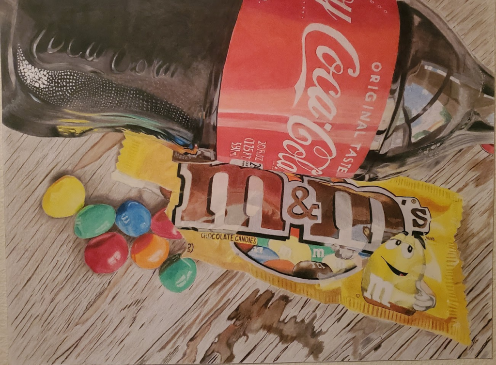
What’s going on, weirdos? Grimm here, and I wanted to use this first Drawing post to talk about the piece that Phil is the most proud of: his Coke and M&Ms piece.
Phil’s magnum opus started before the drawing was even started when he embraced the philosophy that there’s nothing that can’t be made better with a Coke and some M&Ms. He carried that with him for a few years, then, after a tragic turn of events, he decided he wanted that permanent reminder that there’s nothing that’s as bad as his brain told him it was.
With no access to the proper tools or environment, he started the drawing while staying with his parents for a while to get his brain straight. He worked on it pretty diligently until he moved out and got back his own place. Once he got his new studio set up, work continued on the drawing for a few months until he met his wife. Things went on pause for a while as he moved out of his apartment and in with his wife where, after 13 months, he finally put the finishing touches on the drawing.
All told, the drawing has a finished size of 18″ x 24″, making it the largest drawing he’s even done. By extension, even without the extensive breaks, it’s no surprise that it’s also the drawing that took the longest.
It’s drawn on Canson 100lb Bristol Board with Prismacolor Premier pencils and white gel pen for the brightest highlights.
It’s currently matted and framed in a 24″ x 30″ frame that was repurposed from another art piece by a different artist and needs to be re-matted and reframed.
A couple of details he should be especially proud of on this piece:
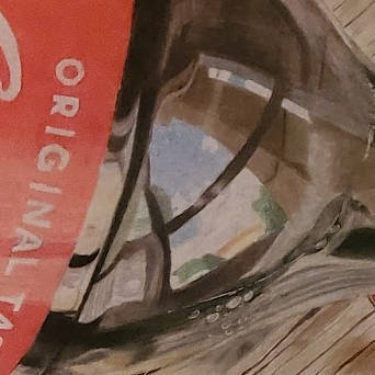
This reflection showing a window pretty accurately captures the contours of the bottle and depicts the scenery outside the window. The bubbles right below that reflection are a nice touch, too.
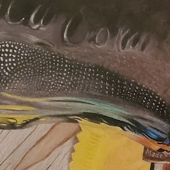
The reflections of the colored M&Ms bending around the iconic Coke-bottle curve, the bumpy texturing on the bottle, and the Coca-Cola branding embossed on the plastic of the bottle are nice touches and add a whole new level of character to the drawing.
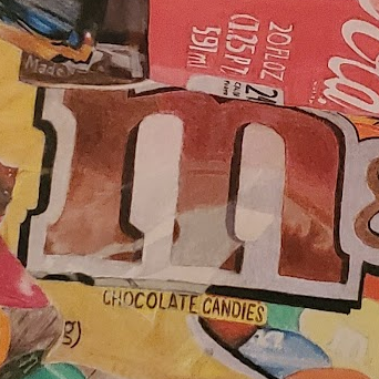
The M on the package is brown but the red from the bottle’s label reflecting on to it gives it a burnt red hue, and the wrinkles in the bag adding highlights, particularly at the bottom of the middle leg of the letter, emphasize the depth of the package.
I’m super proud of Phil for the way this drawing came out, and he should be proud to hang it as the centerpiece of his gallery.
Grimm